
Welcome back! If you’re just joining us, it would behoove you to go back and read the earlier installments of this series: Part 1, Part 2, Part 3, and Part 4. In this installment, we’re going to pick up where we left off. More specifically, we want to:
- Deal with the
[Vue warn]message we’ve been getting in the console - Add some tests
- Improve upon the dev user experience of our component
- Maybe even publish our first official release to NPM!
Dealing with the Warning
Vue has been wagging it’s virtual finger at us with the following message:
This has been popping up in the developer console of our web browser for the demo app that uses our component. It’s referring to this block of code we wrote in our mounted() function:
This is indeed a problem. As the author of that article puts it:
Changing the value in a child component won’t change it in the parent component, but it’s a symptom of not having thought out your component design clearly enough.
Michael Thiessen — Vue Error: Avoid Mutating a Prop Directly, November 2018
Guilty. Let’s think about our design a bit more clearly so nobody can accuse us of implementing an “anti-pattern.”
The Right Way
The first thing we should do is try to figure out how the parent component, i.e. VAutocomplete handles this task. After all, VAutocomplete inherits from VSelect and the items property is first declared there. Michael Thiessen’s article indicates that the way to handle this is with computed properties. In examining the code of VAutocomplete and VSelect, I came across the computedItems() function in VSelect:
Sure enough, if you inspect the code for VAutocomplete you can see that this is how they update the list of items. VAutocomplete‘s computedItems() function returns the result of another computed property filteredItems() which in turn is a filtered copy of the computed property this.allItems(), which in returns an array of objects made by filtering duplicates out of the concatenation of this.items and this.cachedItems. Whew! You have to read through the code a few times before you can piece all of this together, but eventually, what we need to do becomes clear.
We need to override one of these computed functions, but which one? We could do something like:
If we try it that way, we still get our list of states, but we no longer get items filtered as we type, and even clicking on an item fails to select it. Similarly, if we override filteredItems(), unless we duplicate its functionality, we’ll lose the ability to filter. It appears that our best bet is to override the computed allItems() function. In the grandparent VSelect component, allItems() is defined like this:
We need to make sure we understand what this function is doing so we don’t unintentionally lose some key functionality. filterDuplicates() is easy enough–it filters out any duplicate items. What are cachedItems? This is a mechanism that the Vuetify developers put in to handle situations in which the list of items in the VSelect might have changed after it was mounted. cachedItems consists of the original list of items that were passed in via the items prop on the VSelect (or [] if caching is not turned on, which is the default).
In our component, that would translate to keeping a copy of the original list of states that were passed in, but since we’re generating our list of states internally (using the usa-states package), we shouldn’t need to worry about this. As such, we can define our computed property like this:
Go ahead and update your component to match. Once you save, you’ll notice a few things:
- We still get our list of states popping up in the dropdown as expected
- We are still able to filter them when we type
- We are still able to select one of them
- No more
[Vue warn]in the console!
Also, since we no longer are referencing this.items directly, we can get rid of it from the list of base props in the extended interface type up on around line 30.
Mission accomplished. This is a significant milestone so let’s commit our changes. Our commit type should be “fix” since this fixes a bug. The scope is “VStateSelect”, and the messages should be “avoid mutating ‘items’ prop.”
Adding Tests
If you hadn’t figured it out by now, I’m kind of a purist. And as a purist, I feel guilty that I haven’t been following a strict test-driven development (TDD) approach. I mean, we started out the project with some passing tests, but then we just dove right into implementing new functionality without any thought for how we should be testing it. What can I say? I guess my purism (purity?) has limits. That said, I am committed to making sure any code I plan to release to the world at large is thoroughly tested.
Running Tests in “watch” Mode
The extension template I provided comes ready to run tests in “watch” mode. Watch mode is kind of like the dev server, in that every time you make a change to your source code files and save it, the testing engine (Jest in this case) recompiles your code and runs the tests again. The output of the latest test run will show up in your browser. To start the tests, type the following in your terminal:
It won’t be surprising if the tests fail the first time. This is probably because there is a “snapshot” in the src/__tests__/__snapshots__/ directory that no longer matches the output from your component. To update the snapshot, type the “u” key in the terminal where your tests are running. This will re-run the tests and update the snapshots. The first time this happens, the snapshot is pretty much guaranteed to match because the first snapshot is created from whatever output comes from your component. When successful, your terminal screen should look something like this:
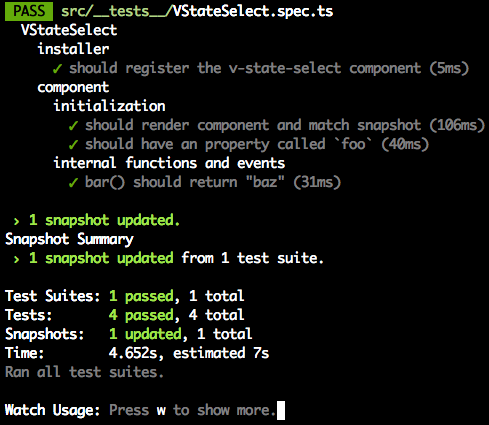
Although they’re designed to be mostly self-explanatory, let’s run through the tests just to make sure.
VStateSelect installer should register the v-state-select component
This tests the code in src/index.ts which is invoked by the Vue.use(VAddressFields) statement on about line 31 in src/__tests__/VStateSelect.spec.ts. In plain English, if the installer works as intended, then there should be a globally registered component with the name “v-state-select.” This will be a property on the global Vue.options.components object. This is pretty much the only test we have that directly checks the code in src/index.ts.
VStateSelect component initialization should render component and match snapshot
Jest supports a form of testing against “snapshots.” Basically, when your code generates a complex HTML structure, Jest can save a copy of that HTML structure as plain text and then compare that to the output of your component every time it gets initialized during tests. You actually have to look at the snapshot the first time after it is generated! Your first snapshot is not guaranteed to be correct. In fact, it is very likely to be wrong. In our case, when I inspected the snapshot, something immediately jumped out at me. The first line of the rendered component in the snapshot looks like:
You’ll notice that the rendered component has a class name for every type in the class hierarchy. VAutocomplete extends VSelect extends VTextField extends VInput, and the kebab-case name of all of these shows up in the class property of the outermost <div>. If we are going to continue with this convention, v-state-select should be among the class names listed here.
Manually edit the snapshot to add “v-state-select” to the list of class names:
Now save it, switch to the terminal and hit “a” to re-run all the tests. Your tests should now fail and produce output that looks like this:
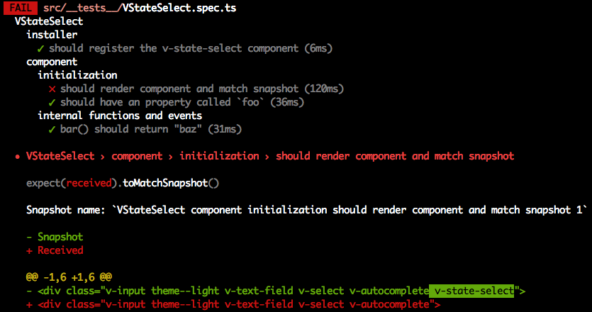
At the bottom of the screenshot, you can see in green the text that Jest expected to see based on the snapshot, and in red the text that it actually saw. This is because at present, our component does not add its own name to the list of classes. Let’s fix this. If you look at the source code for VAutocomplete, you’ll see that among its computed properties, it outputs first the classes of its parent (VSelect) and then adds some of its own. Let’s do the same in our component. In our component, update the computed section to look like this:
Save this code, and watch what happens in the terminal. The tests should automatically re-run, and this time, they all pass because now “v-state-select” is among the classnames on the outermost <div> of the rendered component. Now we, or anyone else, can add custom styles to this component by referencing .v-state-select or one of its children in their CSS code.
The lesson here is that although auto-generated snapshots are a huge timesaver, you have to inspect and edit them manually to use them correctly as intended.
VStateSelect component initialization should have a property called ‘foo’
The third test checks for the existence of a property called “foo” on our component. The “foo” property, while it does exist on our component, probably shouldn’t. I just included it in the template as a dummy property to show how to add and test for the existence of custom properties. Although we could (and should) safely remove it from both the component and our tests, I’m going to leave it for now because later on I want to replace it with an actual custom property.
VStateSelect component internal functions and events bar() should return “baz”
Like “foo,” bar() is a dummy method that I added to the template as an example of how to add and test custom methods to our component. We will remove or replace it later.
Examples of More Complex Tests
The tests included in the extension are pretty simple. Writing tests can be hard, and if you’d like some examples of more complex tests, you can look at the tests I wrote for the VStripeElements package, or look inside of any of the components directories in the Vuetify source code for inspiration and guidance.
What NOT to Test
You should only ever test your own code. You should NOT write any tests to confirm that an Vuetify component, or Vue, or any 3rd party library works as it is supposed to. That is their responsibility.
Our First Test
Let’s write our own test. So far, we really haven’t added that much functionality. We’ve already tested whether or not our component’s class name will appear in the HTML generated. The only other thing we’ve really done is override the allItems computed property. Let’s test that it works as expected. The allItems property is supposed to return an array of objects, one for each of the states (and the District of Columbia) that will populate the dropdown menu. Why don’t we test to make sure that this is, in fact, what is getting returned. Add the following test right after the “foo” test:
With any luck, this test already passes, but it gives us a bit more confidence that the component is behaving as expected. Let’s move on to adding more functionality.
Improving the Developer Experience
In the process of going through the tests, it occurs to me that there are some things our component doesn’t do. First of all, there is no way to customize the list of states that are presented to the user. If someone wanted to say they live in Guam or Puerto Rico, they are out of luck. Fortunately, the usa-states package supports adding US territories to the list. All we have to do is pass { includeTerritories: true } to the UsaStates() constructor.
Let’s finally get rid of the foo property and replace it with something more meaningful. Let’s replace it with a boolean property called includeTerritories that will default to false, but when set to true will include the US territories in the menu. Replace the foo property code with the following:
Technically, this is a bit overkill since boolean variables will naturally default to false, but the Vue style guide recommends this explicit, more verbose style. Now we need to use our includeTerritories prop as part of the UsaStates() initialization. Replace the current line with this one:
When you do this, you’ll immediately get a new red squiggly with the following explanation:
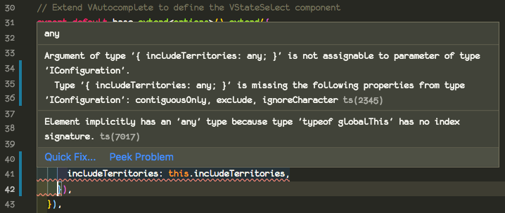
Drats. Foiled again by bad TypeScript type declarations. If you look at our type declaration (remember, the one we created in src/node_modules/usa-states/index.d.ts), you’ll see that indeed, the type declaration for the IConfiguration type makes all of its properties required, even though the usa-states docs would seem to suggest that all of the properties are optional. We have two obvious options:
- Update the type declaration to make the props optional
- Include all of them in our constructor call
Like includeTerritories, developers may also want control over the contiguousOnly and exclude properties. The ignoreCharacter property is not one that is likely to be needed, however. Let’s do a combination of these strategies. First, we’ll make all the properties optional in the type declaration like this (we’ve added the question marks to signify each property is optional):
Next, we’ll add in props for contiguousOnly and exclude. As we’re doing this, you may notice that we have a new red squiggly underneath this.includeTerritories which says, “Element implicitly has an ‘any’ type because type ‘typeof globalThis’ has no index signature.” But wait! Haven’t we explicitly given it a boolean type when we declared it? Actually, there’s one more place it must be specified, which is in the base options instance type near the top of the file. Let’s go ahead and add all of the props we’re about to add.
In addition, I’m going to go ahead and make one more change. I’m going to move the initialization of the usaStates class into the allItems computed property, since that is really the only place it is used, and because this will allow the list of states to be modified on the fly if the prop values get changed by the parent context.
So here is our updated component. I’ve removed all of the unused sections (data, watch, and methods which contained the unused bar() function). Updating our tests to match yields:
We should also test our new properties in the browser by updating our component in dev/App.vue like so:
You’ll see now that Alaska and Hawaii no longer appear in the list because they are not part of the “lower 48.” If we change it to:
You’ll see that Guam, Puerto Rico, and the Federated States of Micronesia (all US protectorates or territories) now show up in the list. Finally:
will exclude both Alabama and Arizona from this list, because we can do so by passing a list either of state names or abbreviations. I added a paragraph above the input that will show the currently selected state value. Of course, these props can also be combined, as well as mixing in props from the parent components like a hint and a label:
The initial value can even be set by giving state a value other than null, e.g.:
Lastly, and this will be left as an exercise for the reader, it would be nice if the developer using this component could specify what values will be used both as the text (that displays in the dropdown) and also the value that gets stored in the variable assigned to v-model.
Checking Coverage
Okay, now that we’re done adding functionality and getting rid of extraneous properties and such, it’s time to check our coverage. From the terminal run:
You should see output that looks something like this:
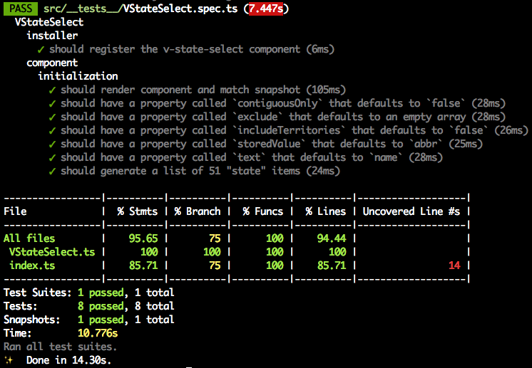
You should be striving for a coverage value >80%. Unless it’s a very simple component, if your coverage is 100%, you’re likely working too hard. One thing to note in the output is that it tells you exactly which lines remain “uncovered” by unit tests. In this case, the only line I’ve apparently missed is line 14 in src/index.ts. I can live with that.
Commit!
It’s been a while since we committed anything and we’ve made a bunch of changes. I realized that the custom type declaration we did for usa-states was not being checked into the repo because the .gitignore file ignores any folder called node_modules by default. You can override that by adding a line like this to the bottom of the file:
Now when you check git status it will show you the src/node_modules folder is untracked and give the opportunity to add it to source control.
I broke this batch of changes up into three separate commits. A “chore” commit that involved adding the missing/incorrect type definitions for usa-states, a “test” commit for the tests and snapshots we added, and a “feat” commit for the new functionality we gave to the developer.
After you’ve made your commits, when you go to git push your changes to the remote repository, git will notify you that “The current branch dev has no upstream branch.” That’s because we’ve never pushed anything on the “dev” branch to the remote repo since we created it. Git will also tell you how to do it. Enter this in the terminal:
This will create the dev branch on the remote repo as well.
Let’s Call it a Night
At the beginning of this post I teased that we might get as far as making our first release, but haven’t we done enough for one sitting? In the next (final?) installment, we’ll merge our dev branch back into master, push it to the remote repo and do the things we’ve gotta do to go live. This will include adding great documentation to the README file and creating a demo on CodePen. See you next time!
Webmentions
[…] like to follow along from the beginning, please head on over to Part 1. When we left off in Part 5, we had just finished adding functionality and tests. In this installment, we […]
[…] They usually signal that there’s a better way to do what you’re trying to do. In the next installment of this tutorial, we’ll address that warning, add some tests, think more about the dev experience of those who […]