Welcome to the 6th (and final?) installment of this series. Now that I’m nearing the end I’ve started thinking of this as more of a “short course” than a “tutorial.” If you’d like to follow along from the beginning, please head on over to Part 1. When we left off in Part 5, we had just finished adding functionality and tests. In this installment, we will:
- Add thorough documentation to the README file
- Create a “playground” demo over on CodePen
- Merge the code on our “dev” branch back into “master”
- Trigger our first release to NPM
Writing the Docs
The quality of the documentation of a package can make or break its popularity on NPM. Even if your package delivers amazing functionality, if your docs are lacking, developers may not be able to figure out how to use it. Yes, some of them may already have enough experience to use your component without too much help, and others may be willing to dive into the source code to figure it out, but most people would just like clear and straightforward instructions on what to do. If you’ve gone to the trouble to thoroughly test your package and make it usable in as many contexts as possible, you owe it to yourself to provide excellent docs.
Here’s the outline that I recommend for your README.md file:
- Title/Name of your package
- Badges (see Part 4)
- 1-sentence Description of what it does
- Link to Demo
I recommend using CodePen or something similar (see below). - Installation (and Configuration if necessary)
Most people don’t really need this, but it’s customary - Basic/Common Usage Instructions
The simplest example possible, for impatient people - Detailed Usage Instructions
Thorough documentation of all available options and defaults, as well as guides on how to handle edge cases and other more common scenarios, e.g. SSR - Contributing (if desired)
How can people help you improve your package, if they are so inclined? - Gratitude
Thank sponsors, supporters, the community, and anyone else who has helped bring your package to production. This is also a good place to let others know how they can thank you! (Patreon, Ko-fi, etc.) - Contact
How should people submit questions, bug reports, or any other requests for help?
Hopefully most of this stuff is self-explanatory. If you’d like to see an example, here are the docs for my VStripeElements package. You’ll notice that I wasn’t super strict about following this outline. It’s more of a checklist of topics you may want to cover than a rigid structure that must be followed.
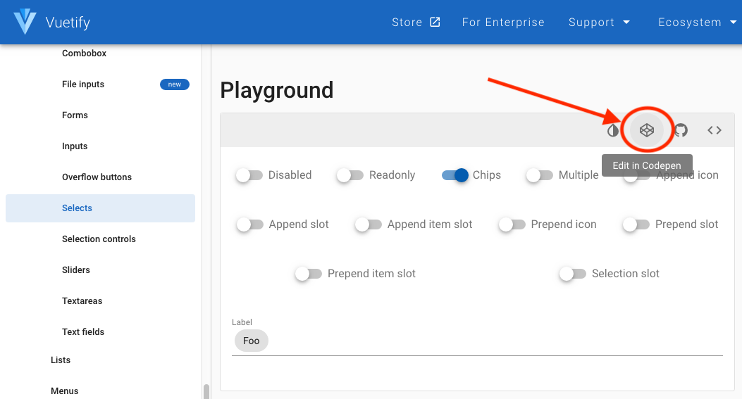
A “Playground” Demo on CodePen
Many of Vuetify’s components have a “playground” example (like this one) that allows you to easily toggle a component’s settings on and off, or otherwise edit them. This allows would-be users of your package the opportunity to see the full breadth of what it can do, and to imagine what it would look like in their own apps. In fact, since we’re extending Vuetify components here, the easiest way to create your own is to go to the playground section for the component you’re extending and click the “Edit in CodePen” button in the toolbar above the demo.
Naming and Saving Your Pen
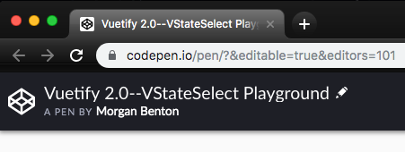
You’ll need to create an account on CodePen and/or log in. Once you’ve done that, click on the pencil (edit) icon in the upper left of the pen, next to its title and give it a good name. I like to specify the version of Vuetify, the name of the component being shown, and then some other descriptive words to let people know what this pen is supposed to communicate. Don’t forget to hit the “Save” button. Once you do, it should auto-save your changes once a minute or so after that.
Linking to Your Custom Component’s Code
If you’re modifying one of the existing playground demos from the Vuetify docs, all of the basic JavaScript and CSS necessary to display a Vuetify pen will already be available (Vue, Vuetify, Material Design Icons, etc.). You’ll have to provide a link to the JS and CSS for your custom component in addition to these. The easiest way to do this is to use a service called jsDelivr.
You don’t need to create an account on jsDelivr. It is a free, open-source CDN (content-delivery network) that can serve the latest version of your component’s JS and CSS safely and reliably to your pen. If you’ve already published your package on NPM, you can link directly to the JS and CSS by constructing a link as follows–assuming you’re using the template provided in this short course (hint: you can go ahead and try out any of these links by copying and pasting them into the address bar of your browser):
If you have NOT released your package yet, you can still link to your built files directly on GitHub:
Once you’ve got the URLs that point to where your code can be retrieved, you need to add them to the settings on CodePen. Click the “Settings” button at the top of the CodePen window. Then in the window that pops up, click the “JavaScript” tab, and then the “+ add another resource” button at the bottom of the screen. Paste the URL to your JS code into the text field that appears. Do the same for your CSS (if you have any–we don’t for the VAddressFields package), but use the URL to your built CSS file. Finally click the green “Save & Close” button to close the popup.
Now you’re ready to create your demo. Your custom components should already be loaded and registered, so all you have to do is just use them!
What to Put in Your Demo
I like to throw some Vuetify “chrome” into my demos (i.e. an app bar) and wrap them in a VCard to make them look nice. Here’s the demo from my VStripeElements package. It’s also a good idea to provide links back to your repo and/or your package on NPM and also back to Vuetify. That way, if someone finds your demo before they find your package on NPM or GitHub, they have an easy way to get to it. I also like to provide some minimal text on what people are looking at. Document both the settings that are unique to your custom component, as well as any settings inherited from the Vuetify component(s) upon which it is based. It’s a good idea to segment them so people know which is which.
A great demo is an excellent way to convince people that your Vuetify extension is of high quality and worth using in their projects. Of course, that may not be super important to you, but if you’ve come this far, you might as well go all the way!
Merge “dev” Into “master”
Okay. Your code is done. Your tests are written. Your coverage is >80%. You have robust documentation, as well as a super sharp demo on CodePen. It’s time to take the final steps necessary to publish our first release to NPM.
Here’s the series of steps to take:
- Check the status and make sure everything has been committed and pushed
- Checkout the “master” branch
- Check the status again to make sure “master” is clean
- Merge “dev” into “master”
- Push the changes to the remote repo
- Watch the magic happen
In your terminal this looks like (lines where we type stuff start with ➜):
Once you’ve pushed the master branch to your remote GitHub repo, this will:
- Trigger TravisCI to pull your code, build it, run your tests, and check coverage
- After that succeeds, it will build your library (
yarn build) - After that is done it will run Semantic release
Semantic Release analyzes your commit history. If you have any “feat” or “fix” commits, that will trigger a new release being sent to NPM. You may not realize it, but this is, in fact, the first time we’ve pushed any changes to master that have a feature or fix commit included. Up until now we’ve been using other kinds of commits.
Congratulations!!!
You’ve now got a package on NPM that extends Vuetify and was built with TypeScript!
It was a lot of work to get this far, but as Isaac Newton said, “We stand but on the shoulders of giants.” A lot of other people put in a lot of effort so that we could do what we’ve done. The magic of open source is the cumulative effects of thousands of people working independently and together to create a fabulous array of tools to make our world better.
In Closing
If you do end up building and publishing something, I hope you’ll tweet about it and mention me (@morphatic). I’d love to see what you’ve done. Thanks for following along this far.
Webmentions
[…] might get as far as making our first release, but haven’t we done enough for one sitting? In the next (final?) installment, we’ll merge our dev branch back into master, push it to the remote repo and do the things […]