
Okay! Down to business. Before we get started writing code, let’s recap how we got here.
- Part 1 introduced VStripeElements, a component that applies Vuetify styles and interactions to Stripe Elements.
- Part 2 gave a detailed explanation of the development environment necessary for you to build your own packageable Vuetify extension.
- Part 3 walked you through the steps to setup your own dev environment building off of my Vuetify extension template.
In this installment, we’re going to build out the custom component we began in the last post, a Vuetify extension called VAddressFields, which will provide input for collecting user address information, specifically VStateSelect, a dropdown for allowing a user to specify what US state they live in. If you haven’t read the other posts, I recommend you at least look over them before coming back here to follow along.
Claim Your Badges!


But first things first. If you made it through the marathon that was part 3, you have a well-earned reward coming to you: badges! Badges have become a stable part of the open-source ecosystem, and they play a role much more important than just making package developers feel good, and allowing them to show off a little. Badges are typically displayed at the top of the README file, and when used correctly, they convey key information about a package that can help people decide if they’d like to use it or not.
Of course, take the badges you see on people’s packages with a grain of salt. Just because a build is “passing” and coverage is >80% doesn’t necessarily mean anything special. For example, right now as I write this post, the package we’re about to write (which as of yet has ZERO code other than the boilerplate we downloaded with the template) boasts that its tests are passing and that it has coverage of 89%! That’s pretty good for a package that hasn’t even been written yet!
Still, some badges are better than none, and experienced devs are smart enough to dig deeper to find out if your package is worth its salt. Some services, like Travis and Coveralls, will provide you with the Markdown markup to add their badges to your README. You might also like to explore Shields.io, that will allow you to generate a wide range of informative and even custom badges.
Getting Started
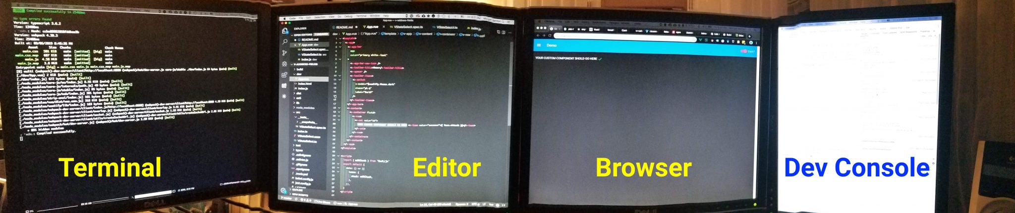
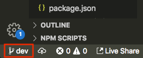
So let’s get into it. Start by firing up your dev server, i.e. run yarn dev from the command line. Open up a browser window so that you can monitor changes as we make them, and go ahead and open up the browser’s developer console (I use Chrome) so you can see any errors that get output in real time. I have 4 monitors (yeah, probably overkill, but they’re old, and I got them basically for free as salvage), and I fill each one with key info: terminal output, my code editor, the output of the dev server running in a browser, and the developer console output. When I have to google stuff (which is constantly), I use the “browser” monitor. There’s usually somewhere between 20 and 50 tabs open at any given time while I’m working.
The first file we’re going to edit is dev/App.vue. This is where we’ll add our custom component, just as if we were using it in a project. Replace the text that says “YOUR CUSTOM COMPONENT SHOULD GO HERE” with the following:
You’ll also need to add state: null to your data property at the bottom of the component. This is the-simplest-thing-that-could-possibly-work. All we really know at this point is that we want a component that will provide a dropdown that allows people to select their state. The only attribute or piece of data that we absolutely have to track is the result, i.e. the state that the user picks, and we’ll store this in a variable called state assigned to the v-model prop of the component. Go ahead and save this file, and watch as the dev server re-compiles it and the content in the browser window and dev console updates. The content in the browser should now look like this:
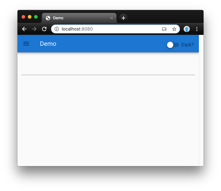
<v-state-select> (click to enlarge)The good thing about this is that it appears our component has successfully inherited from <v-text-field> and is rendering a Vuetify text field in the place where we put our custom element. You should be able to click on the field, add text, and interact with it exactly as you would a <v-text-field> because, at this point, that is exactly what it is. You should be able to add and modify all of the same props of a <v-text-field>, change the theme, and have all of the benefits of using one of Vuetify’s components. By default, text fields fill up 100% of the width of their parent element, have no visible label, hint, or placeholder, and have an underline where the text goes. That’s why all we see is a thin line extending the width of the window. Excellent.
The bad thing about this is that I realize we’re extending the wrong component! The goal of our custom component is to allow people to select the state they live in. Instead of VTextField, we should instead be inheriting from VSelect, or even better, VAutocomplete. Let’s fix this now.
I’m going to open up the VStateSelect.ts file and change the component that it extends:
NOTE: you may have noticed the // @ts-ignore comment on line 16 above. Because Vuetify doesn’t yet export the TypeScript type definitions for all of their components, tslint and tsc (the TypeScript compiler) will complain that they “Could not find a declaration file for module ‘vuetify/lib’.” The // @ts-ignore directive will tell tslint and tsc to ignore the fact that we don’t have a type definition for VAutocomplete. If you take this directive out, it will prevent your component from compiling correctly. At some point soon, I expect the Vuetify team will publish type definitions for all of their components and this workaround will no longer be necessary.
You’ll also note that in the options interface specification (which starts on line 21), in the example code provided by the template, a bunch of the properties inherited from the parent component (VTextField in the default template) have been re-declared as part of the component type. That’s also because without a type definition for VTextField, tslint and tsc are not able to infer the existence of the properties that should be inherited from the parent component. In the future, when the type declarations have been published, you will also be able to avoid these re-declarations. You only have to re-declare the properties that you actually use in your extended component. I’ve removed them all for now in VStateSelect.ts but will re-add them when and if they become necessary as we continue.
If you save these changes, you should see that the dev server will recompile your component and update the output shown in the browser. If you click into that component you should now see something like this:
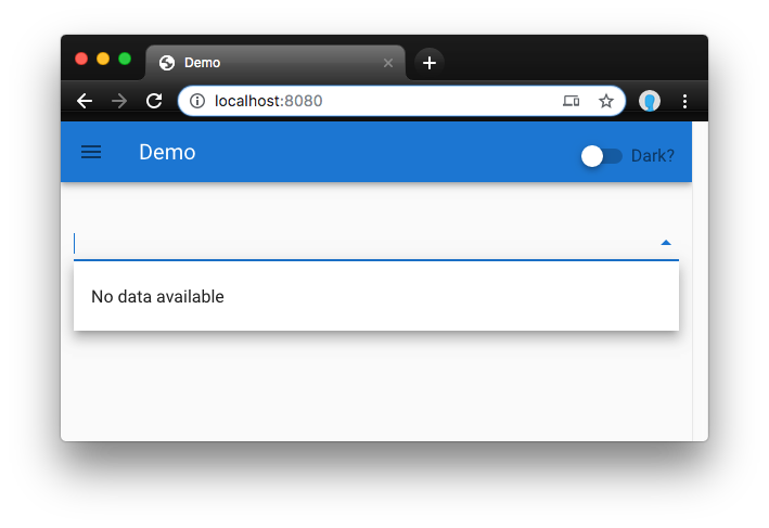
<v-state-select> renders as a <v-autocomplete> with no data. (click to enlarge)Yay! VStateSelect now extends the VAutocomplete component, and because we have not yet provided it with the list of states to select from, it warns us that there is “No data available.” Now we have an excellent baseline from which to start adding the features and functionality to our custom component that will make it useful to the world.
Now would be a good time to commit the changes we’ve made so far to our git repo. Go ahead and run git add . from the command line and then enter git cz to begin the commit process. When commitizen asks you what type of change you’re committing, select “refactor: A code change that neither fixes a bug nor adds a feature” since essentially, this is what we’ve done so far. I’m going to use “set dev baseline” as my commit messages.
Switch to the dev Branch
“Branching” is one of the core capabilities of most version control systems, like git. (If you’re not familiar with git branches, I suggest that you read up on it now.) Semantic Release, which we’re using to automatically publish our package to NPM, will possibly trigger a release every time you push changes to the “master” branch. While technically we don’t have any releases yet, we want to safeguard against accidentally releasing our package to NPM before we’re ready. The Semantic Release docs suggest doing all of your development on a “dev” branch. It’s a very good idea to get into the habit of developing this way. If you type git checkout -b dev into your terminal, this is what you should see:
In the event the “dev” branch didn’t exist yet (as in our case) it will be created. Otherwise it will just tell git that all of the changes we’re about to make should be tracked on the “dev” branch, and NOT on the “master” branch. In the event that we decide we made a wrong turn, we can delete the entire “dev” branch and our package will revert to the baseline we just established in the last step. If you’re using VSCode, you’ll notice that the git branch indicator in the lower left of your editor window will have switched to say “dev.”
Add the State List
Since our component is supposed to allow people to select from a list of US states, we need to provide that list to the component. To do this we’re going to:
- Create a new
statesprop for our component - Populate it with a default list of state names and values
- Use the
statesprop to populate theitemsprop inherited fromVAutocomplete - Disallow users of our component from accidentally overriding
statesby specifying their own additionalitemsprop.
Getting the List of States
Where should we get our state data? Perhaps the most straightforward thing to do would be to head on over to Wikipedia and manually compile our list. However, if you think about it, this is such a common task, it’s almost guaranteed that some programmer out there has already solved this problem for us. Sure enough, a brief Google search yields several packages that look promising:
But how do you pick? There’s no kind of quality control on NPM. Literally anyone at any time can publish a package, and it doesn’t even have to have any running code in it. So it is up to you, on your own, to determine whether or not any of these packages will meet your needs. Here are the features of a package that I typically examine when making this kind of decision:
- When was it published and how often has it been updated?
The version number of the package and when it was last published are listed at the top of the package page on NPM. In general, anything that hasn’t been updated in over a year (or never) should be treated with suspicion. (With USA state data, however, the actual list of states hasn’t really changed in a while, so this might not be a problem in this particular case.) - How many other people are using it?
Every NPM page shows a sparkline chart of the package’s download history. If a package is being consistently downloaded hundreds or thousands of times a week, it’s a pretty good bet that many other developers have found it robust and reliable enough to include in their packages. I’ll only consider a package with few downloads if it is very new, i.e. published for the very first time within the last couple of months. - How good is the documentation?
Good packages have great documentation. The NPM page (which mirrors the README from the GitHub repo where the packages usually live) typically explains what the package is, how to install it, how to use it, and gives clear examples of common usage scenarios. Sometimes I’ll use a package that forces me to dig into the source code to learn how to use it, but not often. - How responsive are the maintainers to support requests?
Finally, I’ll head over to the GitHub repo where the package is maintained and look at the “Issues” and “Pull requests.” How is the ratio of open to closed issues? How quickly do the maintainers respond to questions or bug reports? How quickly do they respond to pull requests from the community? Are they courteous to the people who post questions and PRs?
None of these criteria are absolute. You have to take them all into account before reaching a decision. For a simple package, like providing the list of US states, you don’t really expect there will be many issues. Likewise, the code is likely so simple that it’s not an issue if it hasn’t been upgraded in a while. In the case of us-state-codes their sparkline shows a period of time when they were getting about 20,000+ downloads a week (this is A LOT)! This started suddenly in October of 2018 and ended just as suddenly in February of 2019. I couldn’t really figure out why. Since then they’ve been getting a consistent 3,000 downloads per week. This is still quite respectable and more than the roughly 2,000 dpw that usa-states has been getting. On the other hand, state-list is getting only about 3 downloads per week and never got above the mid-20s. That’s not good.
All of that said, usa-states has clearer documentation, and provides something much closer to what we actually need than does us-state-codes. Plus, usa-states provides TypeScript type declarations, which is great since we’re developing with TypeScript. If a package is getting a couple thousand downloads per week, you can have a certain confidence that even if the original developer/maintainer decides to abandon the package, it will be important enough to someone to take over maintenance and keep it alive. And that’s probably the most important thing to look for. In this case, anyway, it’s enough for me to overlook the fact that usa-states’ current version number is a very low v0.0.5 and it hasn’t been updated in nearly 2 years.
One last thing to consider is package weight. How big (in kb) is the package you’re planning to use? Are you planning to use enough of it’s functionality to justify making people who use your package download their package as well? In the case of usa-states, the estimated download size is only 1.8kb (minified, gzipped), and that’s pretty darn small. If a package gets up into the tens or hundreds of kb, you might want to consider re-implementing just the parts you need manually in your own package.
Installing usa-states
There’s a bit of confusion around whether a package should be installed as a “dependency” or a “dev dependency” (at least, it confuses me). The way I solve this is to ask the question, “In production, would this dependency be necessary to make my package operate correctly?” If the answer is “yes,” it’s a dependency. If the answer is “no,” it’s a dev dependency. In this case, the list of states will absolutely be required in production environments, so I consider it a dependency, which means we should install it like this:
After you do this, you should see that usa-states has been added as a dependency in your package.json file.
Import usa-states Into Our Component
In src/VStateSelect.ts up near the top of our component is a section for importing 3rd party libraries. Add an import statement for usa-states here:
Then in the data section of our component, we’ll instantiate it as demonstrated in the usa-states docs:
Assign a List of States to items
Now add the following code to the mounted() function in your component:
Save what you’ve got so far. Go to the browser tab where our demo is running and click on the VStateSelect element there, and…
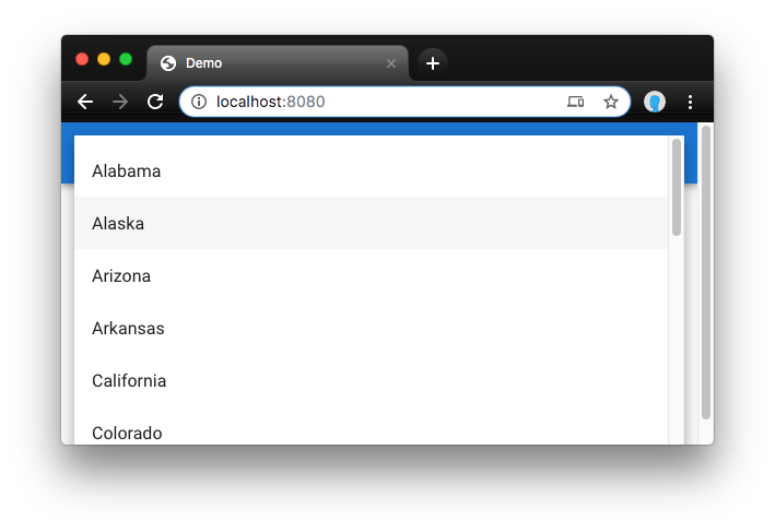
We now have an autocomplete component that is populated with US states! You can play around with it, and watch how the state names are automatically filtered if you type a state name while the select is highlighted. You can use the arrow keys to move up and down through the selections.
Uh-oh! Dealing with the Red Squigglies
Okay, so although the component is doing what we expect, we’re getting some troubling errors, both in the terminal output (where our dev server is running) and in our code editor. You might be tempted to ignore them since, hey, it’s working, right? I’m the kind of dev who just can’t sleep until all of these issues have been resolved, so let’s resolve them.
usa-states has no exported member 'UsaStates'
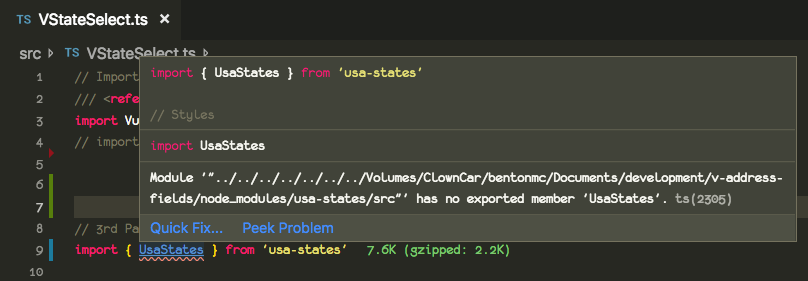
The first error shows up on the line where we imported the usa-states library. There’s a red squiggly line under the UsaStates class that we’ve imported. The TypeScript compiler seems to believe that no such class exists, even though we know that it does: if you open up node_modules/usa-states/index.js, you can see the export on the very last line:
The first place I went to investigate was the repo for usa-states. As it turns out, which frequently happens, this is a known bug. There was even a PR submitted to fix it, and this PR has even been merged into the master branch! Unfortunately, it appears that the package maintainer failed to take the last step of updating the package in NPM to reflect the changes. Sigh. That means it’s up to us to fix the type declaration in our own package.
One way to do it would be to modify the node_modules/usa-states/typings/index.d.ts file (where the package’s types are defined) directly. This is a Bad Idea™. The node_modules folder contains other people’s code and you should never modify it directly. Even if you do, other people who download and want to use your package will not get your modifications.
I found a couple of options for better ways to do it in this Stack Overflow thread, and ended up choosing this one. Essentially, create a node_modules/ folder inside your src/ folder, and inside of that, create a folder for the module whose type declarations you’d like to override, i.e. usa-states/, and then inside of that you put an index.d.ts file that contains your custom type declarations. You can get the correct contents of this file directly from the usa-states repo. Boom. Error neutralized.
Property 'items' does not exist on type 'CombinedVueInstance'
The next error is one that I encountered when developing VStripeElements. Because Vuetify doesn’t export type declarations for their components, TypeScript is unable to recognize that our VStateSelect indeed actually already has an items prop which it inherited from VAutocomplete which in turn inherited it from VSelect. The workaround for this is to re-declare this property in the extension of the base instance type near the top of our file. Modify the section that begins with interface options extends InterfaceType up around line 20 to look like this:
One thing to note here is that we gave the items prop the type Object[]. In reality, a more accurate type definition would be something like { text: string, value: string }[], but in our case we need to make it conform to the same type that is output by the UsaStates.format() function, which is Object[]. This is okay. Both of them are arrays of objects, but one is more specific, and the error is resolved, both in the code editor and in the terminal.
Commit Your Changes
We’re still not done yet, but we’ve made some significant progress. Go ahead and type git add . && git cz on the command line to add and commit your changes. Since we’ve added a substantial new feature to our component, this time select “feat” as the commit type. Also, since now we’re focused on a specific component (VStateSelect) within our larger package (VAddressFields) let’s specify that the scope of our change is “VStateSelect”. For my commit messages, I entered “added states list” and “Added the list of US states to VStateSelect”, and accepted the defaults for the rest.
Up Next
If you’ve been watching carefully, you’ve seen that we’ve been receiving a [Vue warn] message in the browser console from our dev server–something about avoiding mutating props directly. In my experience, it’s a good idea to pay attention to such warnings. They usually signal that there’s a better way to do what you’re trying to do. In the next installment of this tutorial, we’ll address that warning, add some tests, think more about the dev experience of those who will use our component, and maybe even get as far as shipping our first release. See you there!
Webmentions
[…] the next installment of this tutorial, we will build out our VStateSelect component, make sure it is thoroughly tested, add meaningful […]
[…] you to go back and read the earlier installments of this series: Part 1, Part 2, Part 3, and Part 4. In this installment, we’re going to pick up where we left off. More specifically, we want […]