
Recently I have been working on a project built with Vue.js and the amazing Vuetify Material UI library. I needed the ability to accept payments from users and decided to use Stripe Elements to accomplish this. While Stripe demonstrates that their Elements are highly customizable, actually integrating them with Vuetify was much easier said than done.
However, since it’s common for me to integrate Stripe into projects, this situation seemed tailor-made for creating a custom extension of Vuetify.
Complicating matters somewhat, Vuetify recently updated all of their components to be functional components built with TypeScript (the Vuetify 2.0 Arcadia release announcement is worth the read). I should say that I am not primarily a TypeScript developer, but I couldn’t resist the challenge of incorporating the full power of their upgrades. However, since the Vuetify core team was focused on releasing the update, they haven’t yet released fully functional type definitions for all of their components. It proved to be somewhat challenging to get all of benefits of TypeScript while creating this extension.
So, I’m writing this series of blog posts to document the process, for myself and others, of building a packageable Vuetify extension with TypeScript. I hope others will be able to use this guide to create amazing extensions that benefit all of us! This first post will demo the finished package and give a brief overview of the project structure.
Last Things First: A Demo
Here’s a screenshot of what the end result looked like, side-by-side with a regular Vuetify VTextField for comparison of how well I was able to achieve the same look and feel.
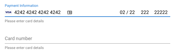
You can also see an interactive “playground” demo on CodePen that will let you experiment with adjusting all of the many available settings. As you will see, the VStripeCard extension supports nearly all of the styles and interaction details built into Vuetify’s other input elements. Vuetify’s components, in turn, are very carefully implemented to reflect all of the design wisdom packed into Material Design text fields.
Build Targets
What did I actually build? Vue and Vuetify components are designed to be used in a couple of different common scenarios:
- Direct inclusion in web pages via
<script>tags - Being imported and used in SPAs (single-page apps) and PWAs (progressive web apps) built (usually) with Webpack
- Incorporated into projects that use SSR (server-side rendering), most notably Nuxt.js
Vue and Vuetify are flexible enough to be used with well-established, and nearly universally-supported variants of JavaScript like ES5, as well as incorporated into projects built with ESNext (bleeding-edge JavaScript) and TypeScript. My goal was for my extension to be usable in all of the same environments where Vue and Vuetify can be used. I think I was mostly successful except for SSR. Because of the way that Stripe Elements are instantiated on a page, I’m not sure my solution is compatible with SSR environments. (I’m not sure though because I haven’t tried it.)
Project Structure
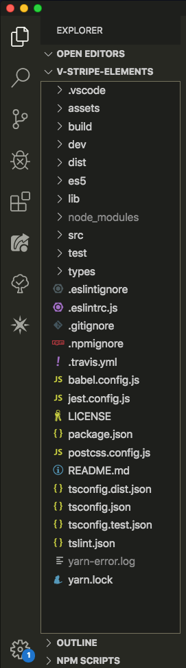
This is a screenshot of the project structure that contains:
.vscode: VSCode editor settingsassets: the logo I used on myREADMEbuild: webpack config and other scripts supporting various build targetsdev: a Vue app environment for visual inspection and manual testing while codingdist: build targets for the browser; what gets served by services like unpkg and jsDelivres5: ES5-compatible modules importable into most any modular JavaScript projectlib: ESNext modules importable into any recent NodeJS or Babel-transpiled projectsrc: the actual extension codetest: unit tests (with Jest)types: type definitions for use in TypeScript projects- …and all of the other standard project configuration files
This is a modified version of the exact same structure used by Vuetify to build all of the components of their library. One thing that surprised me was that even though the resulting extension is reasonably small (browser target is ~14kb, gzipped), and has few dependencies (basically just Vue and Vuetify, and optionally vue-plugin-load-script), there are a HUGE number of dev dependencies necessary to support the dev environment and all the various build targets. Take a look at package.json to see what I mean.
Some Thoughts
Building a dev environment that can package an extension for almost any build target is way more complicated than I anticipated, and I easily spent more time understanding, configuring, tweaking, and debugging the dev environment than I did actually writing the code for this extension. That’s cool. A big part of the reason I do projects like this is to learn more stuff and deepen my skills.
I had to spend an enormous amount of time reading the docs for Webpack, and TypeScript, and Jest, and more than a dozen other packages that all contributed setting up an efficient and responsive coding environment. The cool thing is that now that I’ve done this, the next time I build an extension, it will all go much faster. During the process, I ended up reading about almost every single one of the dev dependencies, evaluating potential alternatives, and considering whether or not it was even necessary to keep.
Admittedly, I made the whole process much harder for myself by choosing to stick with TypeScript as the coding language. Juggling complex type dependencies across several packages proved to be quite time and energy consuming. I now have a much deeper understanding of, and appreciation for, the work done by the fantastic Vuetify team. Using TypeScript definitely improved my code, though, and I’m glad I stuck it out.
Up Next…
In Part 2 of this series, I’m going to take a deeper dive into the dev environment and describe what each of the pieces does, and why it is there.
Fantastic tutorial and resources! I learned a lot about Vuetify and other great tools by following this tutorial.
I’d be really interested in a series about how to create a component library that depends on Vuetify components. For example: I’d like to create and share a component that uses multiple Vuetify components and does a few API calls. I don’t think there’s enough documentation or other resources on the internet to learn about this pattern and think many people would be interested in it. Would you consider doing a series on this topic?
Best Regards